Ever since I got the Kindle Paperwhite 2 I’ve been a bit skeptical about the so-called new and improved E Ink Carta screen technology.
Right now the Paperwhite 2 is the only device using Carta screens; most other ebook readers use Pearl screens. Both are the same type of epaper screen tech produced by the same company, E Ink.
Since the 1st gen Paperwhite uses a Pearl screen with the same resolution as the new Paperwhite with the Carta screen, they make for good examples to compare the differences between the two types of screen tech.
So are the new Carta screens a noteworthy upgrade? Or is it mostly just marketing hype?
Personally, I’m inclined to believe the latter. The background color on the new Paperwhite is slightly lighter and the text is slightly darker. The new screens also have more of a subtle yellow tone than gray. But the difference is so marginal that it’s hard to justify calling one an “upgrade” over the other.
It’s been three years since E Ink went from Vizplex to Pearl. I posted a comparison review with some pictures and I didn’t think the difference was very significant back then either.
Electronic paper technology evolves at a very slow pace compared to other electronics. In just a couple of years we’ve gone from low resolution 800 x 600 (143 ppi) 7-inch LCD screens on tablets to super high-resolution 1920 x 1200 screens with 323 ppi.
E Ink has upped the resolution of their 6-inch screens from 800 x 600 to 1024 x 758 over the past couple of years, and the Kobo Aura HD has a unique 1440 x 1080 6.8-inch Pearl screen, but overall E Ink advances at a slower rate than other technologies, and color E Ink has still yet to become effective enough to really take off.
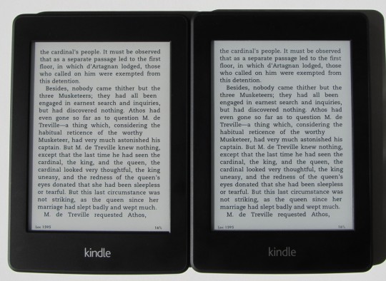
E Ink is always looking for ways to improve their screen tech, of course, but I’m just not seeing much of a noticeable difference between Carta and Pearl. E Ink claims a 50% increase in contrast on the spec sheet for Carta. Pearl has a 10:1 contrast ratio and Carta is rated at 15:1.
I’ll let you be the judge. Do you see a 50% increase in contrast between the two Kindles in the picture at the top of this post? There’s a little bit of improvement but it certainly doesn’t seem like that much.
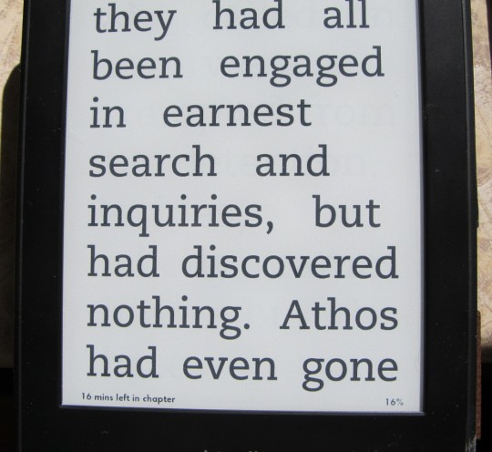
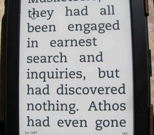
It’s hard to tell with smaller text so here’s a couple of more pictures showing the largest font size (click for bigger). I’ll let you guess which Paperwhite is which (if you are having a hard time telling the difference, the url for each image shows if it is 1 or 2).
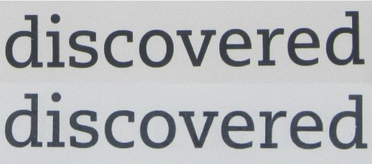
Here’s a look at those same exact pictures above at full resolution. I cropped the same two words from each screen and stuck them together to get a better look.
Up close the difference is more apparent. The black text on the Carta screen (top) does indeed appear darker, and the lines seem sharper. That’s something I can notice with a small font size as well, text being clearer on the Carta screen. But Amazon changed the capacitive screen and the light layer on the newer Paperwhite so it’s hard to say for certain if the increase in clarity is due to the improvements in those areas or if it is the Carta screen. I guess we’ll have to wait until other ebook reader manufactures start using Carta screens to know for sure.


I don’t have a KP1, but in comparing my Sony PRS-T1 (E-ink Pearl 800 x 600) with my new KP2 (E-Ink Carta 1024 x 758), I see a dramatic difference. With the frontlight turned all the way down on the KP2, and out in bright sunshine so that I can compare them when they are both on their best behavior, KP2 Carta wins, no contest. The blacks are much blacker. But the best part is that the background is not gray (which is a color which I find depressing, quite frankly), but it’s a warm cream color, which reminds me of the color of the paper in a real paperback book. It’s a very happy color. And I can almost smell the paper.
Comparing a Sony PRS-T1 to a KP2/KP1 is not an apples-to-apples comparison.
There is only one e-ink screen vendor which the Big 4 (Amazon, Kobo, B&N, and Sony) all use — which of course is E-Ink.
With their latest e-readers, Kobo, Sony, and B&N all use the E-Ink Pearl HD screen and Amazon with the KP2 uses the E-Ink Carta screen.
The apples-to-apples comparison would be comparing a Sony PRS-T3 against a KP2, i.e. same resolution but Pearl HD vs. Carta. I have not done this comparison — but have read tons of reviews including the ones here on e-reader — and they all pretty much say that the Carta screen is “slightly” better — with emphasis on the “slightly”.
The only apples-to-apples comparison right now is the Paperwhite 1 vs the Paperwhite 2. You can’t really compare the KP2 with the PRS-T3 because the light on the Paperwhite never goes off entirely, which makes it really difficult to compare to a non-frontlit ereader because the lighting, even at the lowest level, helps make the background appear lighter than it really is. In fact comparing both Paperwhites is a little off too because I notice that the 1st gen has a much brighter light at the lowest setting; with the lights off you can still read the screen, whereas the 2nd gen you can hardly see the light at all.
I realize that I am comparing devices that are two generations apart, and Nathan was comparing devices one generation apart. I was simply trying to say that, if you have been reading on an E-Ink Pearl device with a GRAY background and you find the gray to be annoying, don’t hesitate to upgrade to the KP2 E-Ink Carta screen with the CREAM background. You will love it.
That’s something I’ve noticed as well. Carta definitely has more of a warm yellow tone than gray like on the Pearl screens. Makes it feel more like a real book.
E-ink has fallen way behind LCD. I had hoped around this time E-ink would be higher-definition and/or in color. If it would be no good for video or action games, it could still fulfill the role of the newspaper, the Sunday funnies and the 4-color comic book. But instead, E-ink is still the monochrome monitor to LCD’s color TV.
Hello guys, thanks for your opinions. I would like to buy the Paperwhite 3/2015 model. Do you think it is worth it? Or should I decide for the older generation?
It’s only a $10 difference so I’d go with the newer one but you could go with the refurbished Paperwhite 2 for $20 less if cost is a big factor.
Anybody observed gray dots on black with E-Ink Carta displays? I was used to E-ink pearl and now on Carta black is not really black. On PocketBook Touch Lux 3 http://www.directupload.net/file/d/4032/wjrulloa_jpg.htm