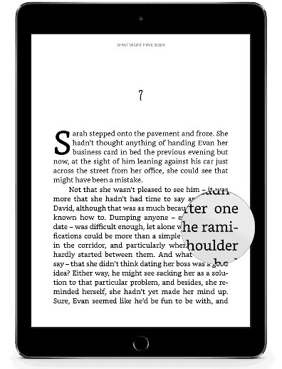
Amazon started rolling out a new typesetting and layout engine for Kindle books last May to improve text layout and to add new features like hyphens, kerning, and drop caps.
Amazon also introduced a new font called Bookerly that was designed specifically for reading ebooks on digital screens (there’s an E Ink version and an LCD version of Bookerly).
The Kindle iOS app and Amazon Fire tablets were the first to get updated to the new layout engine and font.
Then in August the current lineup of Kindle ereaders received a software update that added support for the new features.
The Kindle for Android app was a bit slower to get updated. It finally got the new features added in November, so most of Amazon’s apps and current devices support the enhanced layout engine now but not older devices or the desktop app.
Not all ebooks have been updated to support the new layout, however, so even with the update it doesn’t always make a difference. Amazon has to update every single Kindle book to add support for the new layout features. They use a new KFX format extension for the updated ebooks.
For the most part, I think the new layout engine is a step forward. The improved word spacing is a big plus and lots of people like the new Bookerly font. But one negative that I’ve noticed is that it has made things less consistent. With a few exceptions, the layout of Kindle books always used to look the same. Since the update some books don’t seem to take to the new layout as well as others. Margin spacing is sometimes bigger now, and some books have odd line-spacing or indented paragraphs. Sometimes there are too many hyphens or none at all.
So for me it’s kind of a mixed bag. It hasn’t really lived up to the hype. The consistency isn’t the same as it was before. Most Kindle books look good with the new layout engine but some have weird quirks.
So what do you think about the new Kindle typesetting and layout engine?


I like the new layout and font. I read in bed so I tried the Blue Shade. Are they crazy or what. I hate it. Dim the screen is so much better.
I don’t think any book I own or have bought since the update uses the new formatting as Calibre says everything is AZW, so I can’t say. I use the Bookerly font on my Kindle for Android phone app, but I still use the Caecilia font on my main reader, the Paperwhite. The Bookerly font feels too tight and hurts my eyes.
The major problem with Kindle is that Amazon expects their users to simply accept the default formatting and, whether it’s the old style or the new — I haven’t noticed much difference — the paragraph spacing, indenting and right-hand margins are almost *never* to my liking.
That’s why I reformat the book in Calibre and side-load it. Now, it *used* to be that I didn’t have to do this, and I could just tell KoReader how I wanted the book formatted and each book would automatically get formatted in the same way. That was before Amazon started its terrorist campaign against Kindle users. with KoReader.
Now I have to reformat manually and it makes me angry at Amazon every time I do.